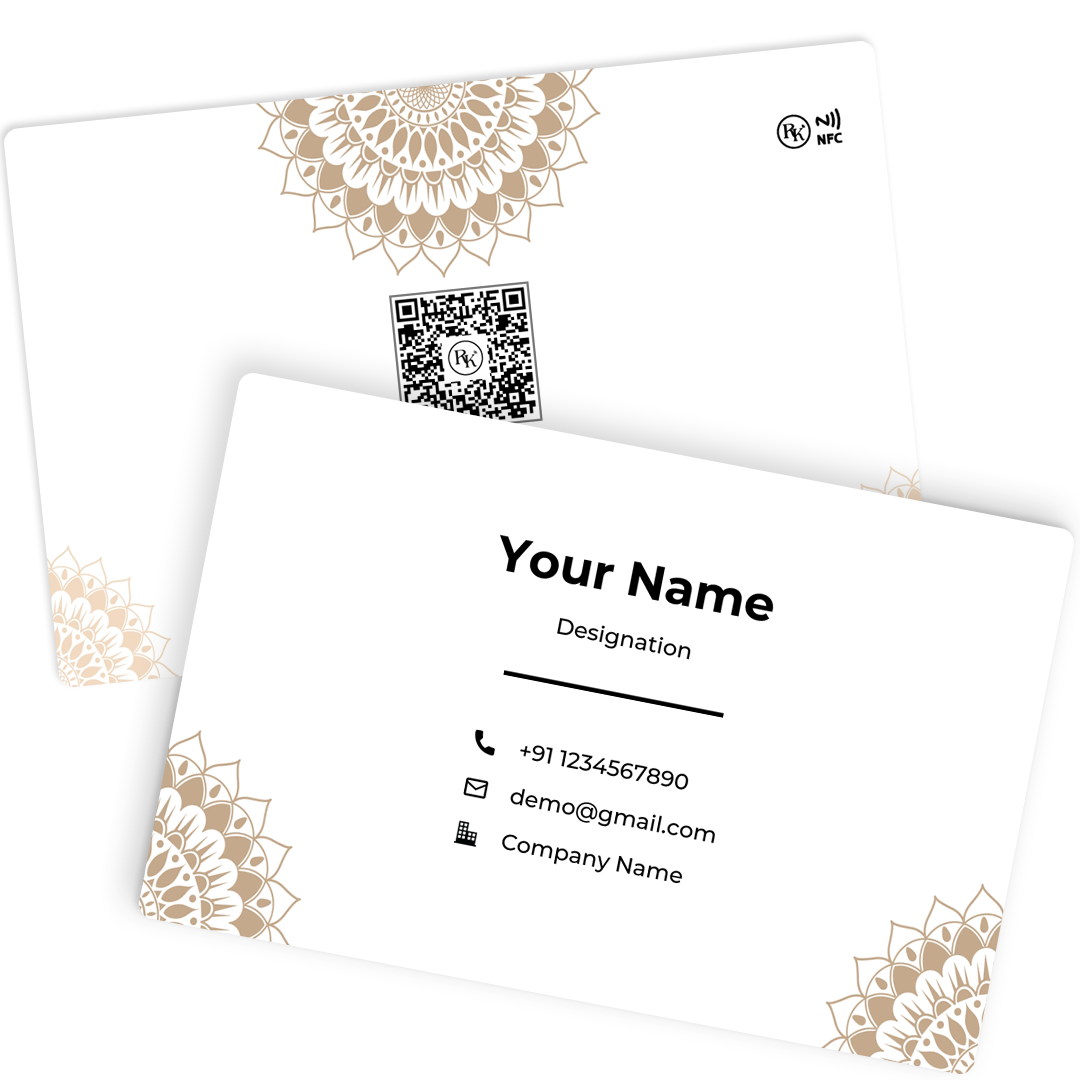
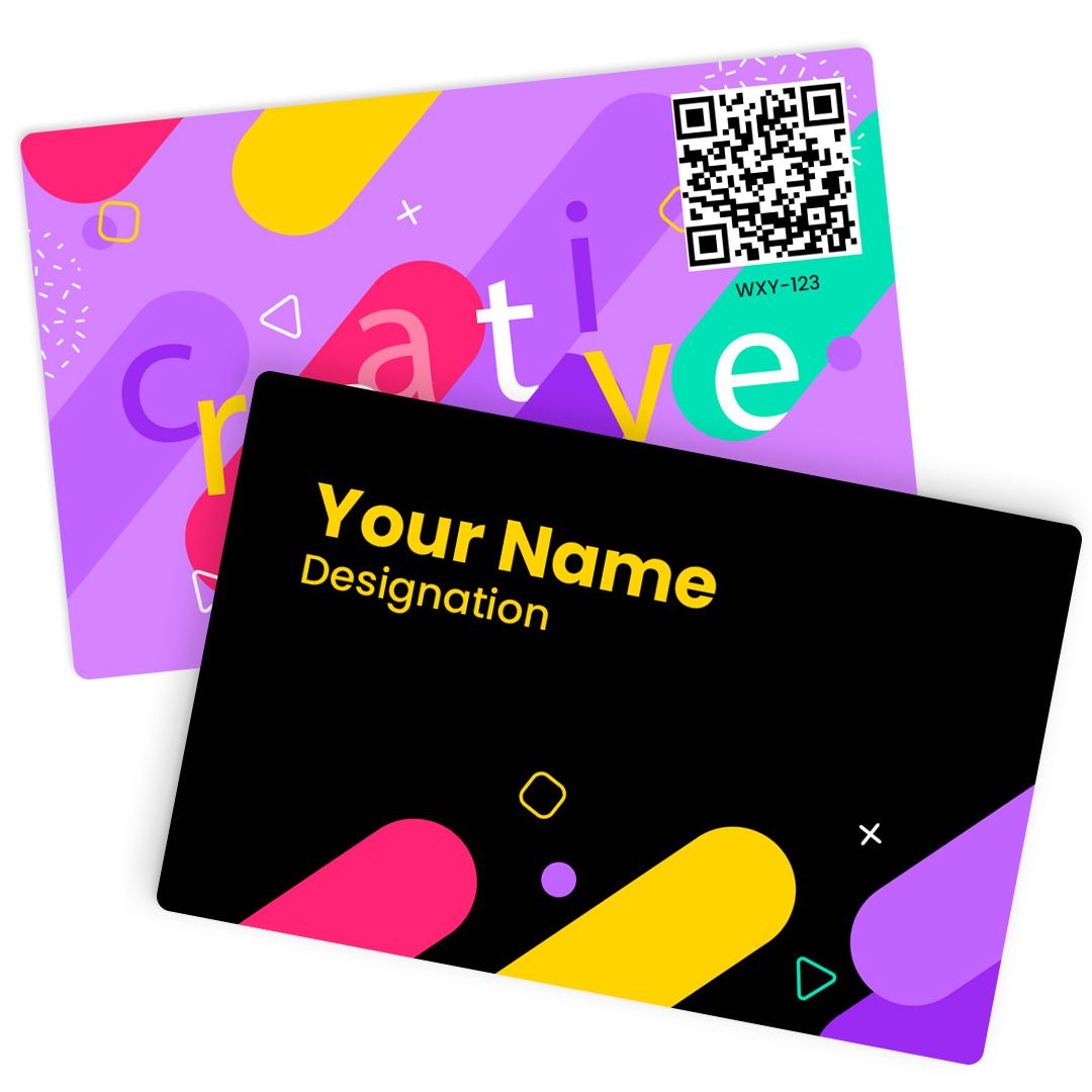
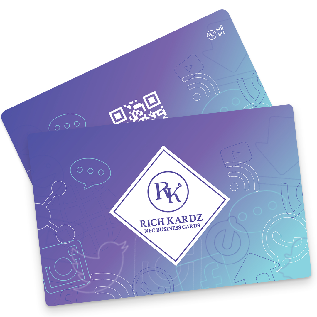
It tells everyone about your company and helps people remember you. These business multi-tools meet many of the basic needs of professionals, like contact information, promotion, and building brand recognition.
You can tell your artist exactly what you want if you read this guide. It has everything you need to know about making business cards. Personality is very important for business cards, and this guide will help you choose the card that fits you best. But let's talk about what you'll need before we start with the steps for making a business card.
How To Make A Company Card
You can start making your card once you have your image, brand colours, and a good idea of what you want it to say about you.
Pick Your Shape
You can skip to the second step if you already know you want a standard rectangular business card. But if you want to know about all of your choices, even methods that don't seem likely, keep reading.
As printing technologies get better and cheaper, designers have more freedom to try out different forms. Die-cutting is a way to print that lets you cut out any shape you want while still making a lot of copies.
Put Your Brand And Other Pictures On There
The image is the first thing we'll plan for the visual parts of your business card creation. Your image should be the most important thing on your business card. However, other details and secondary pictures can sometimes be helpful. Remember that you have two sides to choose from. For example, you could put the name on one side of the business card and the person's contact information on the other side.
Add The Needed Text
What is written on your business card is up to you. Many workers who work from home don't need a physical address, but people who work in jobs that require them to meet with clients in person do. That, or it's a decision made on purpose, like to show off your large social media following. That's why different people should have different text on their business cards.
Pick Out Your Fonts
Once you know what you want to say, you can pick the way it looks. Although writing is important in general, it's especially important for business cards because the text has to be easy to read, and there isn't much room for it. Let's divide design into three main groups:
Size. All of your writing should be at least 8 points to make it easy to read. Different word sizes are fine, though. You want the most important parts, like your name, to stand out. Also, think about the free space. You want your card to be manageable, so make sure the text is small enough that there is plenty of space between each element.
Font. We've already talked a lot about fonts and how they affect your brand personality. If you want to learn more, you can read The 5 types of fonts and how to use them. Just remember to pick a font that fits your style. A clean and modern sans-serif, a unique and beautiful script, or a traditional and timeless serif? Here are some ideas to help you pick the best fonts for your business card.
Think About Different Finishes
It would help if you started thinking about printers now that you're almost done, especially in terms of what they can do. Some printers have unique styles that make an impact that lasts. Check out these "special effects" to see if they can help you with the way you make your business cards.
Conclusion
Your card should be more than just a way for people to get in touch with you. It should also represent you and your brand. You need your card to stand out and make you look good because some people get cards every day. When making your business card, make sure to make it of high quality. Take your time coming up with the right design, and if you need help, find a skilled designer who can make it happen.


